How we mapped Kobe’s 30,699 shots
- Share via
How do you sum up a career like Kobe Bryant's? There are too many stats and too many great moments to pick out just a few to represent 20 years. So, instead of picking a few, we showed them all in a graphic April 14. That required using a programming language called Python (code available on Github) and a creative use of the CartoDB mapping tool so that we didn't freeze people's phones or crash their browsers. Here's how we did it:
The first step was figuring out where all of Kobe's shots came from. Luckily, the NBA keeps track of that, so we didn't have to spend 3,500 hours watching every game he ever played in and writing down the locations (although we did track his final game by hand, just in case).
Originally, every shot was recorded by hand by some unsung heroes of the NBA. Recently, the league has been tracking player positions on the court using computers, but it's unclear whether the new systems are being used to plot the latest shots.
The NBA data is publicly accessible through something called an API, which stands for application program interface. That means we can request data by placing specific phrases in a URL. Here's what we used to download Kobe's shots:
https://stats.nba.com/stats/shotchartdetail?Period=0&VsConference=&LeagueID=00&LastNGames=0&TeamID=0&Position=&Location=&Outcome=&ContextMeasure=FGA&DateFrom=&StartPeriod=&DateTo=&OpponentTeamID=0&ContextFilter=&RangeType=&Season=2015-16&AheadBehind=&PlayerID=977&EndRange=&VsDivision=&PointDiff=&RookieYear=&GameSegment=&Month=0&ClutchTime=&StartRange=&EndPeriod=&SeasonType=Regular+Season&SeasonSegment=&GameID=
You can paste that URL into your browser (or click here) to see an example of the JSON data we were working with. The important parts of the URL are "&Season=2015-16" and "&PlayerID=977." Those correspond to the current NBA season and Kobe's player ID.
After downloading the data, we began some statistical analysis to see if we could find shooting trends throughout Kobe's career. Ultimately, that analysis wasn't used for this graphic, but it did show us that Kobe was a very consistent shooter from nearly everywhere on the court.
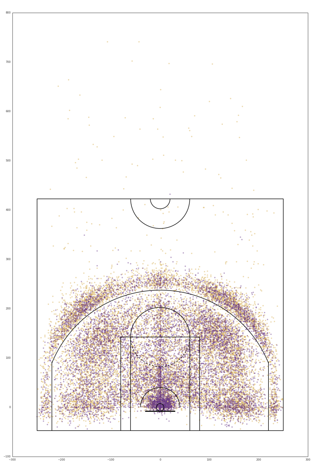
Using Pandas and Matplotlib, we organized the shots and plotted them onto a diagram of a basketball court.
# Some of the Python code to plot the shotsdraw_court(ax=all_shot_ax,outer_lines=True)# First, draw the missed shotsall_shot_ax.scatter(kobe_all_shots[ (kobe_all_shots.EVENT_TYPE == "Missed Shot") ].LOC_X, kobe_all_shots[ (kobe_all_shots.EVENT_TYPE == "Missed Shot") ].LOC_Y,color='#d8b055',alpha=0.5)# Then the made shotsall_shot_ax.scatter(kobe_all_shots[ (kobe_all_shots.EVENT_TYPE == "Made Shot") ].LOC_X, kobe_all_shots[ (kobe_all_shots.EVENT_TYPE == "Made Shot") ].LOC_Y,color='#6a3a89',alpha=0.5)

A great resource during this project was Savvas Tjortjoglou's blog. The code above relies on a Matplotlib drawing of the court posted there.
Using Matplotlib, we were able to draw the 30,000 shots onto an image of a court. But the initial plots were just that — images. The viewer couldn't interact with them, see more detail or choose which points they wanted to see. So how could we make this more interactive?
Displaying 30,699 points in a browser and on mobile devices was going to be a challenge. We used CartoDB, a geospatial database and mapping service. CartoDB takes the individual data points and quickly renders them into square image tiles with an invisible interaction layer. Displaying a few images is much easier for an iPhone than displaying 30,699 points.
But before CartoDB could work its magic, we needed to put the basketball court on the map.
The NBA data includes X and Y coordinates that refer to positions on the court. The units are tenths of a foot (we don't know why), so the sidelines are -250 and 250, because the court is 50 feet wide.

We translated those X and Y coordinates into latitude and longitude (with the hoop at the Staples Center, though you'd never see that in the graphic), and uploaded the data to CartoDB. We then used a JavaScript library called Leaflet to get the tiles and display them on our site.
This is the piece of JavaScript code that made everything work:
cartodb.createLayer(mapchart, { id:"6eadec2c-0204-11e6-865f-0e674067d321", user_name: 'latimes', type: 'cartodb', cartodb_logo: false, sublayers: [{ sql: "SELECT * FROM kobe_all_shots_geocoded_final_merge ORDER BY priority,event_type DESC", layer_name: "allshots", cartocss: getCartoCSS(feature_count), interactivity: "combined_shot_type,action_type,season,event_type,shot_distance,playoffs,opponent,game_date", attribution: "Source: stats.nba.com" }] });One of the most useful features of CartoDB is that it lets us use SQL, a programming language designed to query information from a database. That allowed us to choose which points we want to show on the map. The "sql" line in the code above tells CartoDB to return all the shots and sort them by a column called "priority," which we used to keep certain points on top for interactions. Then it sorts by "event_type," which is the NBA's name for the column that denotes a made shot or a missed shot.
Similarly, we could decide to show, for example, only jump shots, layups, or missed dunks in 2009-10 against the Pelicans.
We had lots of conversations about what to show or not show and the best ways to let readers interact with the data. We decided to use both a guided tour of some big moments and a set of filters. The tour lets people see what we thought was interesting about the data and the filters let them explore.
On the night of Kobe's last game, we downloaded the last of the data and updated the graphic — thankfully, we didn't have to rely on our hand-drawn shot chart. The finishing touch was an annotation marking his last shot. Appropriately, it was a midrange jumper.
If you want to get into more detail about this project, our Python code is available on our Github.
MORE ON KOBE BRYANT
Lakers' win transforms Kobe Bryant's send-off from scripted to spectacular
My 12 years covering Kobe Bryant and moving in and out of his 'circle of trust'
Sign up for The Wild
We’ll help you find the best places to hike, bike and run, as well as the perfect silent spots for meditation and yoga.
You may occasionally receive promotional content from the Los Angeles Times.


