When it comes to life expectancy in America, not all counties are created equal

A child born in the United States in 2014 can expect to live 79.1 years, on average.
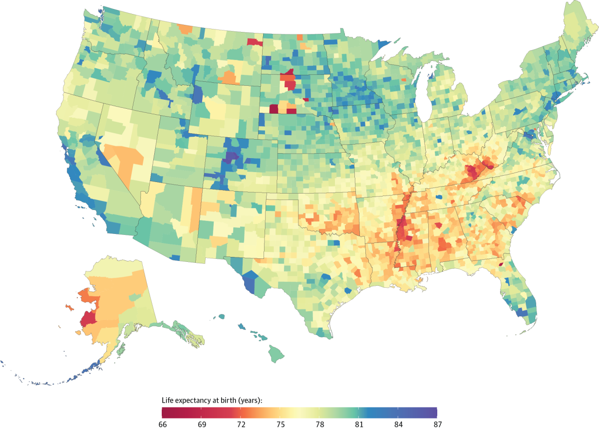
But that figure doesn’t apply equally to all kids across the country. For example, a baby boy born in South Dakota’s Oglala Lakota County that year has a life expectancy of just under 62.8 years. Meanwhile, a baby girl lucky enough to be born in Summit County, Colo., can plan to live to the ripe old age of 88.5.
That’s a difference of more than 25 years. Put another way, the girl in Colorado can expect to live 41% longer than the boy in South Dakota.
These figures come from a new analysis of life expectancies in more than 3,100 counties in the 50 states plus the District of Columbia. Breaking up the data by county makes it easier to see the true extent of health disparities across the country, according to researchers from the
“The magnitude of these disparities demands action,” the researchers wrote in a study published Monday by the journal JAMA Internal Medicine. “Inequalities will only increase further if recent trends are allowed to continue uncontested.”
Life expectancy varies by county — a lot
Some differences in life expectancy are well known, such as the fact that women tend to outlive men. Girls born in 2014 have an average life expectancy of 81.5 years, compared with 76.7 years for boys.
Previous studies have also found “large and increasing” discrepancies based on geography, according to the authors of the new report. But those studies probably underestimated the differences because some counties were grouped together, masking the variation between them. Other counties were omitted entirely.

For the new analysis, Laura Dwyer-Lindgren and her colleagues used data from the U.S. Census Bureau, the National Center for Health Statistics and the Human Mortality Database to come up with life expectancies for individual counties for each year from 1980 to 2014. Some counties were combined for the sake of continuity (for instance, Arizona’s La Paz County broke off from Yuma County in 1983, after the study period began). That reduced the total number of counties from 3,142 to 3,110.
The counties with the lowest life expectancy were clustered in the Dakotas (particularly in areas that were home to Native American reservations); along the Mississippi River in Arkansas, Tennessee, Louisiana and Mississippi; and in the region connecting Kentucky to West Virginia.
In 2014, there were five counties whose combined life expectancy for men and women was below 70:
- Oglala Lakota County, South Dakota (66.8 years)
- Union County, Florida (67.6 years)
- Todd County, South Dakota (68.5 years)
- Sioux County, North Dakota (68.6 years)
- Buffalo County, South Dakota (69 years)
At the other end of the spectrum were three counties in central Colorado. In 2014, these were the only counties in the nation whose combined life expectancy exceeded 85 years. They were:
- Eagle County, Colorado (86 years)
- Pitkin County, Colorado (86.5 years)
- Summit County, Colorado (86.8 years)
Life expectancy gains are not shared by everyone
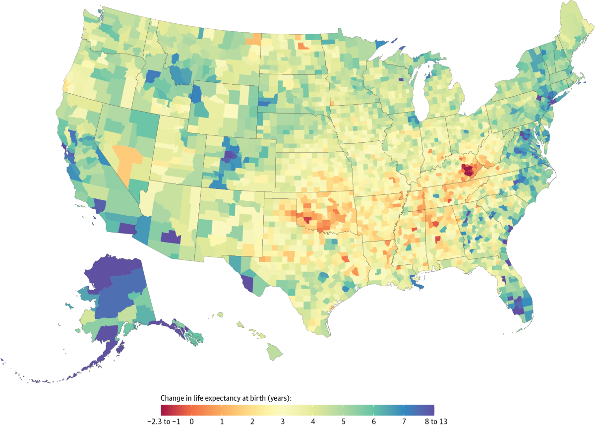
The researchers also tracked changes in life expectancy over the course of the study. On average, a baby born in the U.S. in 2014 could expect to live 5.3 years longer than a baby born a generation earlier, in 1980. The increase was larger for boys (6.7 years) than for girls (3.9 years).
But again, the study authors found stark differences based on geography. Gains in Colorado, Alaska, California and along the East Coast were offset by losses in the southeastern United States, particularly in Kentucky and Oklahoma.

The researchers identified seven counties where the life expectancy of a child born in 2014 was at least 1% lower than it was in 1980. All were in Kentucky:
- Estill County (where life expectancy fell by 0.7 years)
- Powell County (where life expectancy fell by year 0.8 years)
- Clay County (where life expectancy fell by 1 year)
- Breathitt County (where life expectancy fell by 1 year)
- Leslie County (where life expectancy fell by 1.4 years)
- Lee County (where life expectancy fell by 1.5 years)
- Owsley County (where life expectancy fell by 2.2 years)
Meanwhile, seven areas had life expectancy gains of at least 13% during that period. They were:
- Aleutians East Borough and the Aleutians West Census Area, Alaska (13 years of additional life expectancy)
- North Slope Borough, Alaska (11.7 years of additional life expectancy)
- New York County (Manhattan), New York (10.8 years of additional life expectancy)
- Sumter County, Florida (9.9 years additional years of life expectancy)
- San Francisco County, California (9.8 additional years of life expectancy)
- Kings County (Brooklyn), New York (9.4 additional years of life expectancy)
- Kodiak Island Borough, Alaska (9.3 additional years of life expectancy)
“Tracking inequality at the county level over time is an important means of assessing progress toward the goal of more equitable health outcomes,” the study authors wrote.
Seeing which people are most in need of help
The maps make it easy to see where health policy officials should focus their efforts in order to do the most good, the researchers argued.
A more detailed look at the risk of death for people in different age groups revealed a reason why life expectancy was higher in some counties and lower in others:
Although geographic differences in mortality rates decreased over time for children and adolescents, they rose for adults — especially those between the ages of 65 and 85. That makes senior citizens “an especially important target for future research and intervention,” the study authors wrote.
To see how life expectancy has changed in your county, visit the U.S. Health Map from the Institute for Health Metrics and Evaluation.
Follow me on Twitter @LATkarenkaplan and "like" Los Angeles Times Science & Health on Facebook.
MORE IN SCIENCE
Scientists are on alert after the latest changes at the EPA
Another way humans are polluting the environment: Too much noise
Fly along with Cassini: New video gives you a passenger’s eye view of Saturn


