How does a ‘color of the year’ get chosen? The interior world of ‘it’ colors
Last February, inside a conference room at the swank Kimpton Everly Hotel in Hollywood, 30 color stylists from eight countries gathered in small groups, many sitting cross-legged on the floor, surrounded by color swatches, magazine clippings, paint chips, mood boards and oversize easel pads covered with brainstormed buzzwords. The annual gathering from PPG Paints was the culmination of months of preparation and featured 3 1/2 days of meetings that spilled over into working dinners and late-night discussions on cultural trends and societal shifts.
Why were they in L.A.? To decide the Pittsburgh-based paint company’s 2020 color of the year and corresponding color palettes. In effect, forecasting the company’s future.
The decade ahead will be spent in pursuit of serenity and wellness, along with a passion for increasingly multi-functional spaces, global influences and customization, according to data and analysis from online design platforms like Pinterest, Houzz, Etsy and design network HGTV. Here’s how it all breaks down.
Major paint companies develop trend forecasts for consumers overwhelmed by options and to help homeowners and DIYers select colors from a palette that feels updated, fresh and cohesive. Is Millennial Pink over? Will shades of gray continue to dominate? What’s next?
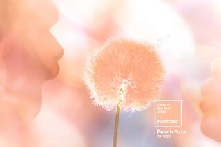
In uncertain times, Pantone offers a comforting choice for Color of the Year for 2020: Classic Blue.
Color experts, paint company marketing departments and product designers must anticipate the colors we want before we even know we want them. Here’s a behind-the-scenes peek at how the colors were chosen by different brands and why you’ll be seeing them everywhere in 2020.
Feeling blue
“This year was really special,” said PPG color specialist Dee Schlotter. “Usually, it takes until the end of the workshop, and then one color bubbles to the surface as being dominant in everyone’s color palette and story, but this year, every single region and every color stylist came with blue.” The 2020 decision for PPG? Chinese Porcelain, an alluring blend of navy and cobalt.
PPG was definitely on to something. Pantone, the New York-based company that standardizes the language of industrial color on a global scale, crowned a similar hue, Classic Blue, as its 2020 pick.
“When you look at a highly anxious, highly contentious world right now,” Schlotter said, “people feel very unsettled, unmoored almost. Blue is a trustworthy, really anchoring color. It’s the color of the sea and sky, and it’s just really reassuring.”
Naval gazing
In keeping with the bluesy zeitgeist of the new decade, Sherwin-Williams chose Naval as its color of the year. “It was absolutely a slam dunk,” said Sue Wadden, the company’s director of color marketing. “Blue was prevailing through all the palettes and all of the themes we were talking about.”
Wadden said a strong sense of optimism along with inspiration from the luxe, Great Gatsby style of the Roaring Twenties — and overarching themes of wellness and nature — all contributed to the company’s choice. “We could have a four-hour conversation about the power of navy,” she added.
First blush
At Benjamin Moore, the optimism of a new era also carried the day. Color marketing and development manager Hannah Yeo said the company’s selection, First Light, a soft, rosy pink with pale gray undertones, felt upbeat, warm and inviting.
“It’s definitely flattering,” Yeo said, but it’s not a color that overwhelms or overpowers a room. First Light is a clever evolution that appears to build on the previously popular Millennial Pink trend, and Yeo said the new hue could be used as a neutral or hold its own as an accent color.
“Pink has been getting bigger every year,” she said, “and it’s getting more gender neutral, especially when paired with a masculine color like blue or Thunder (a gray).
“2020 is the dawn of a new decade,” Yeo added. “What’s more appropriate than the color First Light?”
HGTV Home by Sherwin-Williams also picked pink, specifically Romance, a slightly warmer blush pink with a hint of apricot for its 2020 color.
Green means go
At Los Angeles-based Dunn-Edwards, the growing predilection for pastels translated into Minty Fresh, a light, mentholated green that earned the top spot for 2020 thanks to its calm, cool color and inherent message of hope.
Dunn-Edwards color expert Sara McLean credited the influence of the health and wellness macro trend currently driving lifestyle design and the increasing importance of living sustainably for guiding the company’s decision. “It had to be some sort of green.
“The start of the new decade is a time of optimism, renewal, starting over, of asking what can I do to push forward in life. ... So having looked at all the pastels, green just kept coming to the forefront and being the symbol of rebirth and renewal and ecological sensibilities.”
McLean said her color forecast is a prediction, not a confirmation. “You’re not going to see [Minty Fresh] in the mass market right away,” she said, “but within six months to a year, you will see quite a bit of it.”
The color cognoscenti at Santa Ana-based Behr paint are also seeing green for 2020, choosing Back to Nature, a soft, muted hue with warm undertones. “We’re seeing the rise of these popular color families,” said Erika Woelfel, vice president of color and creative services for Behr. “These blues and greens are everywhere, all different shades, all different variations, and green in the color family has huge bandwidth.
“Of course, [the greens] are all tied to the outdoors and people getting out there and hiking, doing all kinds of activities in city parks and big national parks. They are really making an effort to get out there and engage with the natural world, so we landed on Back to Nature as that perfect color that just represents how we’re feeling and how we’re living. It’s a color you see in the outside world, and it easily translates inside — very relaxing, very restorative.”
Gray, gray, go away? Or here to stay?
In spite of their differences, all the colors chosen to represent a fresh start for a new decade have something in common, namely their ability to pair well with shades of gray.
The much beloved color of wispy fog, heathered moors and stormy days has reigned supreme for years — and despite continued rumors of its demise shows no sign of stopping.
Which is what prompted the Pittsburgh-based paint company Glidden to instead select an “anti-color of the year,” namely Whirlwind, a gray that plays well with others and isn’t looking to be cast in a leading role.
“It’s a very soft color. It’s timeless,” said Kim Perry, Glidden color guru and marketing assistant. “It’s a perfect backdrop to coordinate with the other trending colors, like the deep blues and golden yellows.
“I definitely see grays still trending, maybe becoming a little warmer, but I still see them trending the next couple of years.”
How to get your color on
Thinking about adding color to your world in 2020? We’ve got pro tips to get you started:
Testing, testing. Get an 8-by-8 paint swatch and observe how the light affects the color at different times of day. “Light heavily influences the color you see on the wall, and there’s no way the store or even your friend’s house can match the lighting in the room you intend to paint,” said Hannah Yeo, color marketing and development manager for Benjamin Moore.
Lightbulb moment. “If you’re using a bulb that has a softer, warmer glow, it’s going to have a similar impact on the paint,” said Kristen Chuber, senior director of marketing for Paintzen, an on-demand booking platform for painting projects.
Accent walls, yes or no? “Some people say they are on their way out,” Chuber said of accent walls in contrasting colors, “but we have a lot of customers who are just looking for one feature wall, so that’s a nice starting place to [try color].”
Use quality paint. Advances in technology make application easier. “It gives consumers more confidence,” said Sue Wadden, director of color marketing for Sherwin-Williams, “so that lends a hand toward not being afraid to tackle a big, colorful project.”
Standout color. Not ready to paint an entire wall? Paint shelves, built-ins, cabinetry, interior doors or a kitchen island with a complementary color, Chuber suggests. “It really makes that area pop,” she said, and “that becomes the feature of the room.”
Dip a toe. “If you’re not someone who has gone the saturated route before, it can be a little scary,” said Chuber. “We recommend starting with accents.”
Choose from a curated palette. “The number of color options can be almost paralyzing — you don’t know where to start,” said Chuber. “If there are 100 blues to choose from, [the color trend picks] give some guidance. It says, ‘This is a color that a paint brand stands behind and a lot of people in the design community are excited about.’”
Do you like it? Personal style always trumps a trend.
More to Read
Sign up for The Wild
We’ll help you find the best places to hike, bike and run, as well as the perfect silent spots for meditation and yoga.
You may occasionally receive promotional content from the Los Angeles Times.


