These colors are trending for 2019: Here’s how to choose the right one for you
The color clairvoyants have spoken.
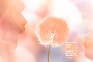
Pantone, the industry leader, decreed Living Coral to be the reigning color for 2019, while paint companies like PPG picked Nightwatch green, Benjamin Moore selected Metropolitan gray, HGTV Home by Sherwin-Williams chose Reflecting Pool blue, Valspar presented a dozen designer hues, Behr forecast Blueprint, and Dunn-Edwards championed brick-inspired Spice of Life.
It’s a smorgasbord of style. So how to choose? Here’s your guide to selecting which color of the year is right for you.
We turned to Gillian Rose, Los Angeles-based color scientist, interior designer and founder of the Science of Color, for guidance. She suggests choosing a color that reflects how we want our homes to make us feel, which will ultimately be guided by our DNA.
“Our responses to color are part of our genetic makeup,” Rose said. “It’s a physical response.”
Natural selection
“Introverts and extroverts require very different amounts of color just to feel calm,” Rose said. “Typically introverts tend to go more to the cooler, softer tones and extroverts go more for the warmer, deeper, stronger [colors] because they’re looking for stimulation.”
She said the process of personal style is intuitive. “Introverts have plenty of internal stimulation, so they are not looking for a lot of color contrast or patterns; the extroverts are the ones looking for the big jolts of color.”
Use your words
In choosing between the hot new colors of 2019, Rose suggests starting with your intention for the space instead of just picking your favorite color.
When we think of our favorite color, “we’re thinking of it as an object, something smaller than we are,” Rose said. “When we are creating environments, those are larger than we are, so it’s a completely different relationship.”
The self-described introvert said her favorite color is emerald green, but she wouldn’t paint a room with it. “On my ring finger it would look lovely,” Rose said, “but I would never be able to live in a room that color. Just because you love a color, it doesn’t have anything to do with how you would feel in a space painted that color.”
Throwing shade(s)
Consider adjectives like nurtured, playful, sensual, secure, frivolous, peaceful. “We all have different moods,” Rose said, “but really try to home in on, out of all the emotions, which ones do you want to experience all over?”
And then chose the hue that helps creates that feeling.
“Some people want to come home and feel calm, some people come home and want to feel energized,” Rose said, “so I really think that the most introspective thing that anyone can do is to spend some time and really think about what they want to feel like when they come home, let that resonate and choosing the color comes separately.”
We’ve rounded up 2019’s most directional hues in this gallery.
Bonnie McCarthy contributes to the Los Angeles Times as a home and lifestyle design writer. She enjoys scouting for directional trends and reporting on what’s new and next. Follow her on Twitter @ThsAmericanHome
ALSO
How designer Nate Berkus blended old and new in his L.A. kitchen remodel
They found a real estate unicorn: A house with great ‘bones,’ ready for decorating
You’ve never seen a kitchen island sink like this
How online art galleries are serving up talent — and sales — without the ‘tude


