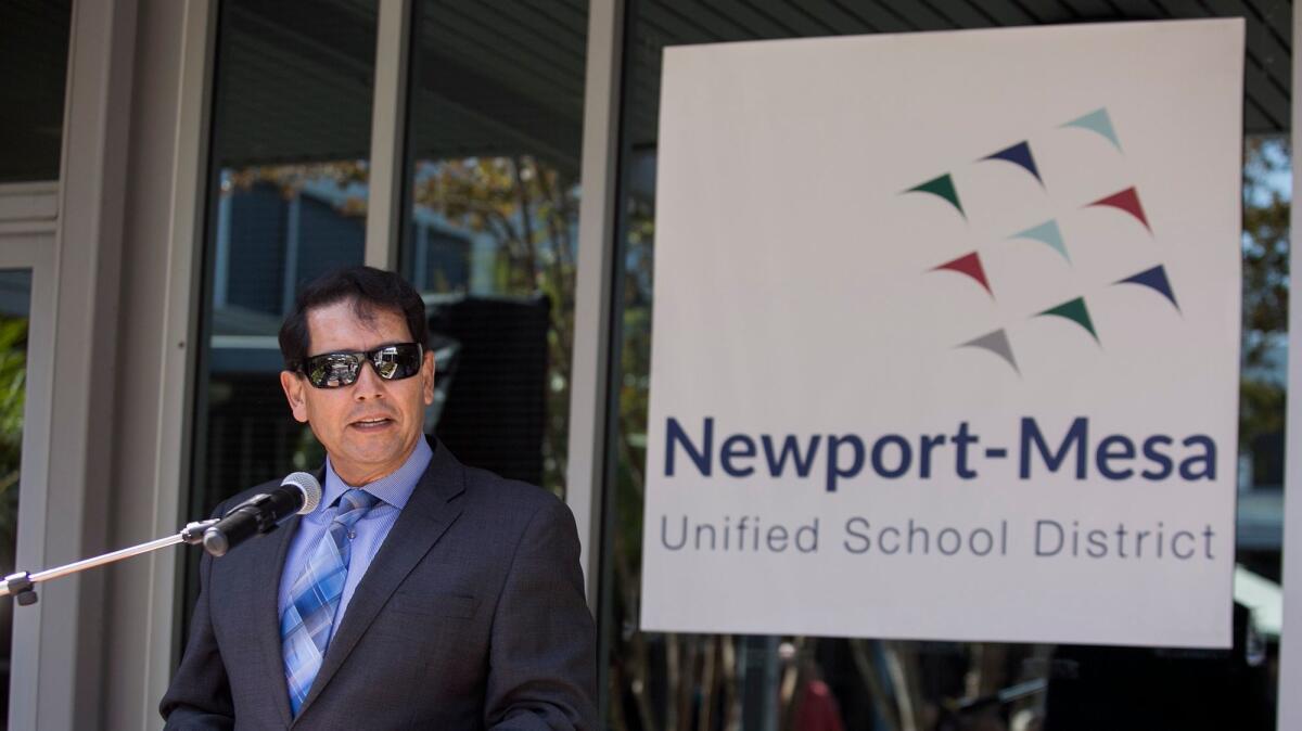
New logo for Newport-Mesa Unified will be phased in starting next month

- Share via
A variety of logos representing the Newport-Mesa Unified School District have been used interchangeably throughout its 50-year history, but a newly unveiled logo will be phased in next month to help unify the 32-campus district.
The new logo now illustrates nine multicolored triangular shapes shooting upward. The colors are representative of school zones. Below it is the district’s name.
“It’s contemporary and forward thinking,” said board President Karen Yelsey Thursday. “To me we’re moving forward and moving up like birds flying in the sky.”
The new logo will slowly replace the district’s emblem of an oval containing a sailboat and an outline of two people holding hands in the coming months.
Yelsey said their long-time logo was “getting old” and now is a good time to change it as the district celebrates its 50th anniversary.
The logo was approved 4-3 in May by the school board with trustees Martha Fluor, Judy Franco and Walt Davenport dissenting.
A district committee — consisting of student representatives, parents, certified and classified staff, community members and two board members — collaborated with Lentini Design & Marketing, the Los Angeles-based company hired for the rebranding.
The design company led two, two-hour meetings to learn about the district’s history, background and culture and then designed logos based on the input received. The committee then chose the top two logos for board recommendation.
“Forward thinking, unity, inclusion, progression and collaboration” were some of the themes mentioned during meetings, said Annette Franco, district spokeswoman.
The triangular shapes could be viewed as “arrows, fish or birds,” she said, but it’s meant to symbolize individuals working together toward a common goal.
But trustee Fluor said she still isn’t “crazy about it.”
“I’m in all favor of the logo being changed, but we shouldn’t have to explain what it means,” Flour said. “Is it birds? A boomerang? I don’t know.”
Fluor, who has served on the board since 1991, said she she would have preferred students who are studying graphic design present options to the board — a process done for its original logo.
Though presentations were made to the school board prior to adoption, Fluor said it was her “fault for not realizing it wasn’t a bid process.” But even when the final logos were presented, she said only “the bare minimum” was shown as to how it would look on stationary.
“I’m having a hard time picturing it on diplomas,” Fluor said. “I’m disappointed — I think we could’ve done better.”
Websites, electronic communications, letterheads and printed materials will have the new logo during the first phrase of transition, Franco said. Printed materials like business cards and brochures will be ordered once stock is depleted.
Larger items such as fleet vehicles adorned with the district stickers will be ordered once “it gets old and starts peeling away” and staff uniforms will be reordered with the new logo during its “typical reorder schedule,” Franco said.
The district spent $8,000 to work with the design company, Franco said, but there will be “no additional costs of implementing it.”
“Trash cans, concrete signs, those will all be down the road unless there’s an opportunity for one-time funds,” Franco said.
Twitter: @vegapriscella
All the latest on Orange County from Orange County.
Get our free TimesOC newsletter.
You may occasionally receive promotional content from the Daily Pilot.


